Monday, January 31, 2011
Sunday, January 30, 2011
Nikon 300mm F4 AFS will not autofocus with TC14e, TC17e, TC20e or the newer ones … what to do?
Short answer – send it to Nikon and they will replace your lens’s motherboard with one that grounds properly and works with all combinations.
The nitty gritty of my story:
A few years ago, I picked up a used 300mm F4 AFS from a store in Calgary for a decent price.
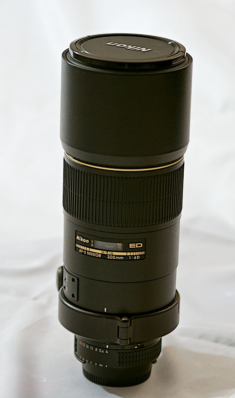
This lens was mint and it shot beautiful images. I grabbed a Kirk foot just to make sure that I did not get blur from the weak stock foot, which I still have (if you need one, let me know.)
This lens begs to be shot from tripod and the results are worth it.
But when I added the TC17e to the mix to be able to shoot at about 750mm effective, the autofocus would not behave with the D70s. It was completely wonky. Lens alone, no problem. Lens and TC, totally useless.
I tried the lens at the Fletcher Gardens and met up with some RA nature club members and tried someone else’s TC14e and got the same result. Big problem …
While searching for the answer, I picked up the D2Hs, a huge honking professional camera with a monstrous batter, and low and behold the combination worked!
This has to have been the boost in current overcoming what was to turn out as a grounding problem inside the lens. I got the hint on DPReview and the grounding issue is apparently moderately common with this lens. It’s design is marginal.
But with the D2Hs around, I really did not need to get it fixed and I left it. Then I upgraded to the D300 from the D2H3 and BAM! It was back.
I called Nikon and arranged transport to Toronto. They called me a week or two later with the estimate … somewhere around 200 bucks … might have been 250. (Should have been free.)
When I got the lens back, every combination worked perfectly. I have since sold the lens to a nice guy in Australia and I am sure that it continues to work flawlessly …
So … bottom line … if you 300mm F4 AFS has AF issues with any of the teleconverters, you will need a new motherboard …
Thursday, January 27, 2011
Nothing Special Hits Two Milestones
This blog started out as mainly a diary. Since then, it has morphed into something a bit more oriented to photography, but retains some feeling or the diary. But because it is a little bit of a mix, which is another word for “confused”, it will never be much of a force in the blog-o-sphere …
Still, a few months ago I realized that I was creeping up on a couple of fairly significant milestones for page views and visits and I wanted to track them so as to make a post like this for each one as I hit the milestone.
Of course, I then forgot about it and ended up blowing through both a few weeks ago. So without further ado …

Now … there are plenty of sites out there that do more traffic every single day than the lifetime traffic of this site. But I am still pleased that my little hobby blog has had over a quarter million visits and a half million page views.
Olympus XZ-1 versus Canon G12, Panasonic LX5 and Nikon D3s – Who is the low light champion? ** Updated **
Well, most of you can guess the champion without actually seeing one line of text … the D3s is the world champion in low light, and no one is really all that close. But that’s not why I include the D3s … I include it as a control so we can see what should be in the crops I am going to use to analyze these cameras at 1600 ISO.
Note: Many have commented that I have stepped on my … well, you know … by comparing the XZ-1 at 1600 against the Canon at 1600. Fair enough. I will be publishing comparisons at the appropriate ISO deltas later today. Stay tuned …
The new article is here.
Those of you who have been to this blog before know that I like to bring my own brand of bullshit brilliant analysis to what I see. I will take a set of crops from the DPReview comparison engine and interpret them for you. You are free to disagree … if you do, though, I’d appreciate a comment added to this article so that I can answer you and correct the text if I agree.
You can read about this new Olympus camera at the DPReview site on this page. So I won’t bother repeating anything but to say that the camera is considered an enthusiast cam, which puts it squarely against the S95/G12 and the LX5. So that’s who I will use for comparison. Simple enough …
One more thing … the D3s does not have 1600 ISO crops available, so we’ll look at 3200 ISO crops. Close enough, since the D3s has about a 5 stop advantage over the compacts …
A penny for your thoughts … well, maybe not a penny. But a coin nonetheless. And the Olympus really mucks it up with classic smearing and chroma noise. The yellow blotching is disturbing, since this is not even shadow. The other two give a credible performance, mimicking but not matching the D3s.

I like the yarn area for testing the ability to render subtle tonal changes and very low contrast details (individual threads that make up the larger threads) which make or break the feeling of texture and 3 dimensions. The D3s is magnificent here (duh) but the Olympus is not bad. It clearly has a bit more contrast than the others, which helps in this test. But the heavy NR also creates a slight flattening effect that removes some of the 3D look. The G12 is a bit better in some areas and worse in others. So in the end this is mostly a tie between the two. I think the LX5 comes in third her, but only by a hair.

In the paper clip area, the Olympus sweeps to an easy victory. This is the perfect subject for its extra contrast and one thing you notice is the lower level of edge artifacts that are clearly evident in the other two. The D3s soft because of depth of field in case you were wondering.

An area that really surprised me in the clock face. The others all give a very credible rendering of the small tick marks. But the Olympus completely bungles this at the top of the face. They aren’t even visible … here we see the dangers of excessive noise reduction. So the Olympus comes in third by many lengths …

In the opposite corner, the heavier processing in the Olympus shows up as improved saturation, almost matching the colors and richness of the D3s. But the edges take on a hard look with many artifacts that the others do not have. I would say that this will be ok in print, but will cause problems for those who like to process their images. Definitely look for ways to turn down sharpening, NR, contrast and such if you plan to process.

Looking deep into the shadows, we see that the Olympus is again completely outmatched. Very excessive blue channel noise reminds me of the G10. Probably caused by similarly too-small pixels.

Another example where the Olympus processing is playing havoc with fine edges. The others are soft, but very credible looking. The Panny surprises here with excess noise in a non-shadow area. That would make me a bit nervous about using it in low light.

The globe is the clearest example yet of the dangers of excess noise reduction. This is just nasty … while the other two are very credible here, as with the watch face.

With the sculpture image, the excess NR in the Olympus removes enough detail to hand a fairly easy win to the other two. The LX5 is pretty off color here, but then it seems to do that. A weakness in my opinion.

The paintbrush on the left side hands the Olympus another tie with the Canon.Not a bad rendering, although some grain shows up. The bottle in the background shows excessive blue channel noise from the Olympus, but the Canon and Panny have really blotchy rendering of the bottle’s smooth surface, so all in all I consider this just a mess for them all :-)

Ok … enough. There is lots more to explore if you want to … go here.
My Analysis:
- Bottom line – this cam is a challenge in low light.
- The Olympus has too much blue channel noise in shadows.
- The Olympus has too much noise reduction, which mucks with edges a lot.
- The extra contrast of the Olympus does look good on some subjects.
- The Panny has white balance issues.
- The Panny is better than the Olympus in most crops, but never better than the Canon.
So … for a general purpose shooter without long reach as a requirement, the G12 would be my choice. For a compact in the pocket, it’s sister cam, the S95.
Update: For web use, they are all fine as shown in the second article here. More importantly, that article compensates for the differences in lens speed at wide and at telephoto. So read that one for a more accurate take on the subject.
RAW does not change the results very much, as this crop shows … I changed out the D3s for the D7000 because the D3s only had 200 ISO RAW crops …

That blue channel noise makes processing the Olympus a nightmare. I know … I processed many a Canon G10 image in RAW.
Tuesday, January 25, 2011
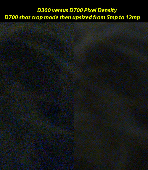
D700 versus D300 – Testing Pixel Density
Introduction
In my previous article, I found that light density (the actual amount of light falling directly on the sensor in any given interval of time) is your friend. Generally speaking, as ISO rises, so does noise. But if you stop down in low light and use longer shutter speeds, the noise rises much more than if you shot wide open. So that adds great value of larger aperture lenses for low light shooting.
So this article turns its attention to testing of pixel density. As I mentioned in the previous article, there has been a raucous debate on the Fuji Forum at DPReview.com this past week. An incredible amount of measurebating and some really unpleasant looking comparisons between a tiny sensor in a compact and a cropped sensor in a dSLR. The problem being that the crop is so severe that there are no pixels left with which to compete. The results look like crap to me.
So I thought I’d take the proverbial swing at it. I’ve been arguing that higher pixel density leads to more chroma noise … that’s the ugly blue and yellow blotchy patches that really ruin an image, far more so than simple grain. And this test will show me if that is true. Also, what about the detail advantages of the resolution making up for the bigger pixels of the smaller files? Well, to test that we will upsize the smaller file to match. A small bit of sharpening to compensate for the interpolation and we are back to perfect parallelism.
Method
So I wondered how to run the perfect test. And it hit me … the D700 can shoot in crop mode at 5mp. This is the equivalent of a D300 with less than half the resolution. If I use a tripod and the same lens on both, I have the perfect test platform … two cameras with identical sensor generations and sizes, but with different resolutions, and hence with different pixel densities.
The only challenge remaining was to shoot equivalent images with every parameter perfectly matched. Even one parameter with a mismatch can call the results into question. And let me tell you that this is far harder than it sounds. I shot the test for two hours, three nights in a row. And tonight I finally got a pair of NEF files with which I can find no faults. Every parameter is matched. Note: With NEF it is not necessary to match the jpeg engines up, but I do that anyway just to be perfectly safe. The manufacturers do like to twiddle the files without telling us after all.
So, first we get two great captures. I take my little soapstone sculpture of a family of owls and I wrap it in a black boa. Plenty of detail in the statue and plenty of shadow detail in the boa. Let’s see how this goes …
Here are all the settings in one go with the D300 on the left an the D700 on the right. There is not a single difference except for sizes, and that difference is the whole point of this test :-)

Just so we know what is happening at the sensor level, the following diagram shows the life-sized ratio from the full frame sensor of the D700 to the APS-C sensor of the D300. The D700 shows a mask in the viewfinder when I shoot in crop mode, which looks a lot like this.

So … the ratio of pixel densities is 5mp to 12mp, which means that crops from the D700 are coming from images that have had pixels interpolated 2.4 times. This is above the recommendation for optical teleconverters by quite a stretch. It certainly has the potential to put the D700 at a significant disadvantage, just as the gang of four on DPReview would have us believe.
Web Sized Images
Before I show the crops, let’s look at the originals downsized with no processing other than the equalization of the conversion in ACR. Here is the D300 version followed by the D700 version.


Now, remember that these web images are very small. About a half megapixel, which means that there is no possible advantage to the D300 here. And I think the D700’s much larger pixels has improved shadow detail and definition here. It is simply a more pleasant image to look at tonally. One reason why I shoot the D700 almost exclusively these days.
Crops and Analysis
Crop 1
The bridge of the nose between the eyes is where I focused both cameras.

Crop 1 shows us that the D700, after being enlarged 2.4 times with a small amount of sharpening to compensate for the interpolation, is not only holding its own, but the cleaner pixels are in fact beating up on the D300 a bit. Right between the nose you can see that chroma noise and grain are taking their toll on the edges, yet the D700’s much cleaner pixels are handling it with aplomb.
Remember that you are looking at crops from 40” prints … but these are exactly the kind of cameras that are used to make 40” prints :-) … so the test is perfectly apropos. And what this shows me is that the cleaner pixels of the D700 will in fact beat 2.4 times as many smaller pixels from the D300. This is what has been the basis of my argument with the gang of four on the forum. I can even explain it, although it taxes my limited knowledge base to do so … but that gets saved for the end.
Crop 2
The bottom right corner is the darkest overall part of the image.
Here, the difference is blindingly obvious. More grain, larger grain and out of control chroma noise on the D300. Much less of everything from the D700. So what happened? Smaller pixels … that’s what.
Crop 3
An area on the left side where a few hairs from the boa are standing up to be counted.

Again with the noise difference. Getting old by now and is expected. But again we find the D700 outperforming the D300 in details as well. This is counter intuitive until you realize that the issues here are mainly down to edge destruction by grain and chroma noise. There is zero noise reduction in these, so that cannot be involved. It’s down to the effects of noise causes by smaller pixels.
Crop 4
The left eye area.

Same thing here … larger grain, more grain, lots of color blotching. The result is that the 5mp are winning the detail battle again. The D700 makes a far better enlargement. This is reminiscent of the days of the D2Hs, a professional quality 4mp camera that was laughed at. Until, that is, people saw enlargements made from its stunningly clean pixels. This was the precursor of the D3 success and up to about 800 ISO it was pretty magnificent.
Well, it is obvious to me that shooting my D700 with the 18-200VR at 5mp is going to give me better results in high ISO situations than the D300 at full resolution. Who’d a thunk?
Final Analysis and Explanation
So How the heck can the D700 win a battle where it comes in with 2.4 times fewer pixels? Well, I am going to go out on a limb and suggest the following:
The D700’s pixels catch 2.4 times the number of photons, assuming rectangular pixels. The high ISO I am shooting amplifies the photons and the shot noise by 32 times in the analog domain. That’s the first major imbalance tilting towards excess noise in the smaller pixels.
It also adds significant amp noise, which is the second imbalance towards noise. My theory is that the extra noise from both factors (assume read noise is constant on the same sensor generation) overwhelms the much smaller pixel counts, leading to much increased grain. This is clearly visible.But how to we further explain the significant increase in chroma noise? The color blotches are very obvious after all. Well, the much smaller pixels in shadow are are going to starve a bit in the D300. And since this light is predominantly red, it is the red channel that is underrepresented. When we make the blue channel push to set white balance, again the small pixels are overwhelmed by the push of the blue channel, which is very significant. The green channel also takes a beating, which shows up as yellow blotching. This is the third major factor tilting to noise.
It works for me at least …
So … I’m not saying that we should all beg for fewer pixels. But if we can see the differences so clearly at these low pixel densities – D700 is 1.4MP/cm2 and D300 is 3.3MP/cm2 and with a 240% advantage for the D300 in resolution, then what exactly should we expect when we take pixel densities from the 45MP/cm2 in the ZS3 to the 50MP/cm2 in the ZS7? And with only a small advantage in resolution of 20%?
A bit of a travesty, I imagine … which is exactly what many have observed in the compacts, and which has now been confirmed in full by this test.
Monday, January 24, 2011
Light Density – Does it make a difference to noise?
Well, by golly, it does. First off, what is light density? Well, it is the number of photons hitting the sensor. More photons hitting the sensor in any given interval of time means denser light. You can think of this as the “flow” of photons in much the same way as a pipe carrying more water or a wire carrying more electrons (current.)
The exposure, then, is determined by the shutter speed and the aperture, which is really saying the number of photons that hit the sensor in the time the shutter is open. Now, some of you are chipping in with “but what about sensitivity?” Well, the sensitivity determines the brightness of the image from a given exposure. And since digital sensors enhance the brightness by adding gain to the photon count, usually in the analog domain but not always, then the apparent exposure (brightness of final image) includes the total amount of light with the gain applied.
So … who cares you ask? Well, as it turns out, I do. This weekend, a raucous debate on the Fuji forum centered around the concept of Equivalence. The idea of Equivalence being to achieve identical images from two entirely different cameras with differing sensors, lenses, pixel densities etc. The subject appears to involve more than a little mental masturbation, but there are many good points made in the text of the paper on which all the arguing was based. You are welcome to read all about it here.
Now … I was wondering how the light density would affect noise. The author of the paper swears that the only advantage of a larger sensor over a smaller sensor is the size of the aperture needed to get the same (equivalent) image. It goes kind of like this: you shoot the D700 at f/2.8 and the D300 at f/2.0 and you now have identical images. At least, that is how it should work since now the depth of field is the same and the diameter should be the same. I.e. we have matching densities of light. Actually, that’s not even correct … because if this is the same lens, then you need the aperture to be open to exactly the same size to get matching density … it is “total amount of light” that is equalized by changing apertures. See … it’s too complex to be of much use in practical photography. But it is a measurebator’s wet dream …
I want to explore some concepts from the paper … and I will over the next couple of articles. But let’s start by changing exactly one thing … the density of the light on the same sensor with the same apparent exposure. This has been a hugely controversial subject over the weekend.
So … leave ISO alone, since we want the same gain. Change the aperture by cutting it down dramatically, then increase shutter speed dramatically. Equivalent apparent exposures at different light densities (from the sensor’s perspective.) I set custom white balance as well, since auto white balance was changing at different exposures. That is a bit freaky by the way, as it indicates that the sensor is responding differently to halogen light based on shutter speeds.
Well, the F300 shocked me with how it responded. The longer exposure, despite being the same total amount of light, was extremely noisy in the blue channel. I t completely freaked.

Well, that’s just bloody awful. Clearly, with this camera (and I would be quite willing to bet that it generalizes fairly well with the tiny sensors), you want to avoid longer exposures if possible. I.e. you want to shoot wide open so that the light hitting the sensor is as dense as possible.
Update: It has been pointed out that 4s is in the territory of thermal noise. And of course this gets worse with the amplification of noise at higher ISOs. Still, the staggering size of the effect at a relatively short 4s exposure does not make a lot of sense to me as a purely thermal effect.
Update 2: I’ve been pounded on the Fuji forum by a group of individuals that I have dubbed the Gang of Four. There are actually two silent members and two obnoxious members who patronize the whole forum in their quest to dominate everyone in it. Interestingly, I’d come to think of them as a virus before finding out that they have done this in other forums. And like any virus, the nourishment they get allows them to keep going. I’ve stopped reading them at all. But meanwhile, I found this comment from Thom Hogan regarding long exposures, which I think puts in perspective my comments in this article. I had every expectation that 4s and 8s were not overly long exposures. Here’s Thom’s comment:
“Since the camera seems perfectly fine for long exposures measured into the low minutes, I'll take a longer exposure over higher ISO and keep the little bit extra in the shadows, just as I did with the D2x.”
Now … how did “low minutes” become “low seconds?” Ask Fuji I suppose … or maybe thermal noise is not the culprit the GOF would have us believe.
Now, 3200 ISO is a real stretch for small sensors, although you must admit that the left half is not terrible. In fact, let’s take a peek at a processed version.

Ok … it’s not great, but hey … you can’t expect much at 3200 ISO.
One more experiment for the evening. I lower the ISO to something a bit more reasonable and crank the lighting to allow me an 8 second exposure (max on the F300 remember) at minimum aperture of f/14. That gives me the required 3 stop range for the test.
And here is that test at 400 ISO … the difference is subtle enough in the noise area that I chose to present it as an animation instead of side by side etc …

Interesting how the smaller aperture picked up reflections. Unfortunate too … anyway, there is still an effect, and that’s good enough for me. Watch your light density … buy better lenses to keep exposures shorter at higher ISO. Especially as sensors get smaller … I’d be really careful of that with the 4/3 sensors, since there is definitely an option to shoot wider apertures.
Update: 8s is even further into thermal territory. Yet the differences here are much less obvious, no doubt because the amplification of the differences is lower. So thermal noise might be the culprit, but that does not obviate the conclusion that higher light density is good, which is all I chose to conclude from this experiment.
Next experiment will discuss the D300 and D700. How is the noise at the same light density? If I shoot the D700 in APS-C crop mode, then the only difference is the pixel density. 5mp versus 12mp in the same area on the D300. Sounds like fun … stay tuned …
Sunday, January 23, 2011
Black Swan
| Just saw this for the second time in a week. There are moments in this movie that are utterly visceral … moments that carry you along with no sense of time or of being in a theater. Totally immersive. I would liken this experience to Avatar, where you sometimes forget where you are. If Natalie Portman does not win best actress for this movie, then a grave injustice has occurred. I can also see best picture and for sure Aronofsky as best director. Of course, who knows how the Hollywood politics will manifest come the awards … |  |

Saturday, January 22, 2011
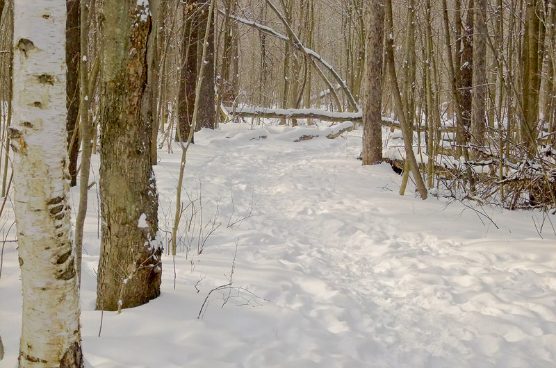
F300EXR – Walking in the woods …
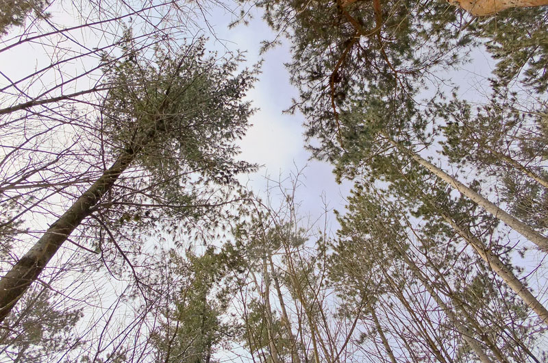
Another lovely day, I had planned to drive to the office at lunch and stopped for a few minutes at the Monaghan Forest to see how the snow of the last few days had manifested. By now, many of you will know that I am thoroughly addicted to how fresh snow looks on trees and land.
The F300EXR was in my pocket, as always. Today I am shooting on 100 ISO with no exceptions. Bracing the camera if necessary instead of allowing it to raise ISO. This is landscape photography and so base ISO should generally be used to preserve the most detail possible.
Upon parking, the first thing I notice is these lovely branches in a very well balanced tree. The detail is remarkable. In fact, I shot a number of images at both 6mp and 12mp in order to see where the threshold is for loss of detail at the higher resolution. In this image, a lot of the finer details on distant branches etc were smeared out by noise reduction. The image still looked fine at web sizes, but I used the 6mp image as it had better edge integrity and looked more like a 3-dimensional object.
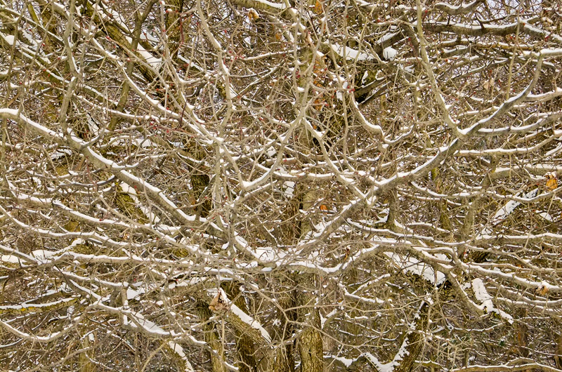
You’ll really need to click through in order to see it in full glory. Although glory might be a strong word. Jonathan hates this image as it has no subjects and no specific focus. For me, it is about the random nature of the branches that form a regular pattern that I happen to find beautiful.
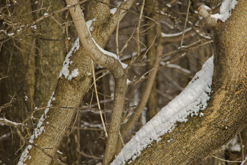
Now, this next image is a close up of this tree, but a little lower down. It peers through a couple of main branches into the forest behind. And I absolutely love the tone in this one. And the detail of the snow that has formed a sort of spine along the back of the big branch.
Here, I did choose the 12mp image as it had more detail and a better composition. More balanced.
On 6mp versus 12mp images with EXR cameras: What I have always said is that you really should shoot EXR cameras at half-resolution for general purpose shooting. And I stand by that. The reasons are two-fold – (1) the noise reduction at 12mp make a hash of fine edges and distant low contrast details, and (2) at base ISO you are forced to use DR100 mode instead of DR400 mode. In harsh light this alone will ruin a lot of images.
But … if you take care to learn where the threshold of distance and lighting is, or if you bracket your sizes as I did here and then choose the better one, you can find that closer images with larger and more contrasty details can benefit slightly from the higher resolution. But it is not for general shooting as the vast majority of normal images benefit from DR400 mode and the netter NR handling of half resolution mode (bin + blend.)
And just to make my recommendations a bit more ambiguous, this is the second image in a row where I preferred the 12mp image.
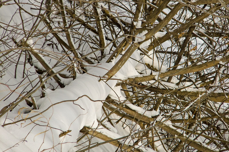
In the above image, the lighting is pretty flat, with little overall contrast. So DR100 at 12mp is not a problem. Yet the local contrast is extreme between the snow and the branches. And so there is little to fear from NR kicking in. And since these are rather smooth branches, any softening effect of fine details is mostly lost in the downsizing. So again a pathological example of a shot that worked at the higher resolution. However … ask yourself if the difference between 6mp and 12mp matters when displayed at .3mp? It doesn’t …
And the triplet is complete … another high resolution image downsized here. This one is so detailed that it’s simply noisy-looking. Not much to redeem it, but I wanted to capture the broken glass … you just cannot escape the less appealing elements of society …
And finally, we get back to the images that looked much better at half resolution. Here, the distant details resolved better when NR was less aggressive.
Click through, as this one has excellent distant details. This answers the critics who believe that the EXR cameras cannot be used for landscape photography. In some circumstances they work quite nicely, and of course the brighter areas where the sun fall work far better at DR400 than they do at DR100 on most other cameras. For cameras from other brands, you simply must try their software dynamic range solutions and hope that they work without increasing noise too much.
Oops … another where I chose the 12mp version. This image was underexposed and hardly seemed worth rescuing. But the closer tress have nice bark detail and I like the interplay of sunlight and shadow on the snow, so I processed one of them. And the high res looked just as good in this case so I chose that one.
I always find images with any amount of flat surfaces look better in half resolution modes because the subtle tonal shifts needed to preserve low contrast details and the 3-dimensions of an object that is not as dramatically shaped will be better preserved when noise reduction is less aggressive.
I could be barking up the wrong tree there, but I don’t think so.
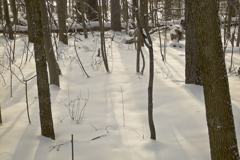
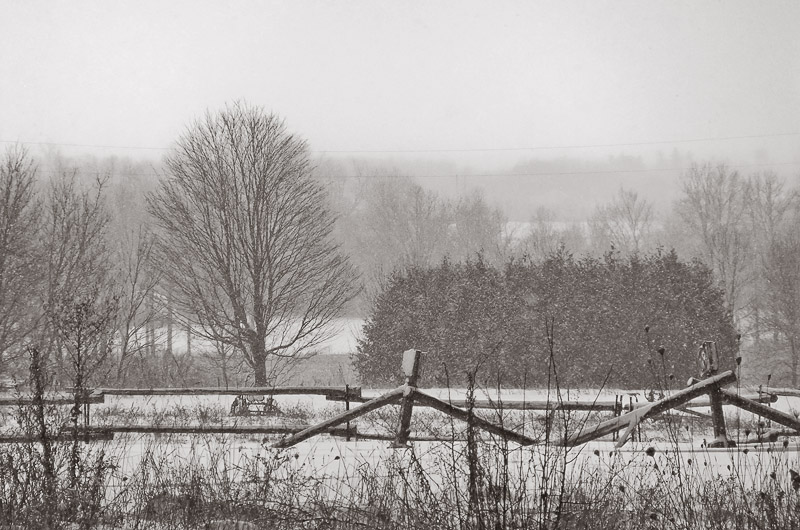
A lovely pastoral scene here. Fallen logs covered in snow. The low resolution scene won this battle.
And again the next scene went low resolution because DR400 preserved the skies much better.
A note on switching back and forth between L3:2 and M3:2 – The EXR cameras correctly maintain ISO at 100 and switch DR from DR400 at half resolution to DR100 at full resolution. Further, they mark the change in DR in yellow so it is obvious what you have done.
This next scene also brings pastoral to mind as a description. This is shot across the highway into a scene at the local farm. The elements all fell into balance and at full zoom I was able to frame them all perfectly. Further, the details are quite stunning in this duotone presentation. Here, the branches of the tree were somewhat smeared by the higher resolution shot, so paradoxically all this incredible detail was better preserved in the lower resolution image. Such is life with Fuji jpeg engines these days …
I can’t wait to get access to Fuji’s RAW engine in the F550EXR compact and the HS20EXR at even higher resolution.
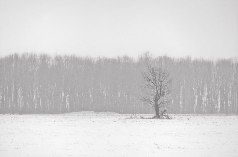
And finally, a scene that I have shot so many times with every camera I own. I stopped as I was driving because the misty look of the ice crystals perfectly set off the distance from this small tree in the center of the farmer’s field (I call it the Sentinel) to the patch of woods in the background. Another duotone, although a different mix of colors.
And that, as they say, was that. Off to work …
Thursday, January 20, 2011
Consider shooting RAW because you are going to get better over time …
Many reasons are given as mantra for why it makes sense to shoot RAW instead of JPEG when you have the opportunity and are not constrained. I add that last bit because some people shoot in situations where they need to turn over the images essentially directly from the card. Photojournalists and sports photographers for example … I once shot a Globetrotters event as one of the fan photographers and was given a card and told to shoot medium jpeg. Worked out fine, but you get my point.
So … I happened to be looking over some images in my long unused flickr page and came across this hand held shot of the moon.

Yuck, I thought. This is grainy as hell …
So I went back into my archives to find out what I has screwed up. I had shot it hand held while walking around Lake Buena Vista inside Epcot at the Swan and Dolphin resort, and had cranked the cam up to 3200 ISO to get fast shutter speeds to handle any camera movement, but I should have tried some images at lower ISO and slower shutter speeds. 1/1000 is absolute overkill.
So today I spent about 5 minutes with my best RAW processing tools, including the latest ACR and some Photoshop plugins like PKSharpener 2, which just came out, and Topaz Denoise 5, which is only a few months old.
I’m sure that you will agree that the results are quite improved …

Click through to the larger versions to see the differences more clearly.
So that is a good lesson to reinforce what I already knew … get the best quality capture you can, because the tools will get better over time and so will you …
Tuesday, January 18, 2011
D700 – Experiment in perspectives …
Nothing terribly formal here … I just felt like shooting the donkey and the owls (a Wolf original sculpture in soapstone) … so I popped them onto a bed and lite the room with the trusty horrid halogens that make for such a tough test for my bad light ISO ladders.
Here is D700’s attempt to deal with this light. Not great …
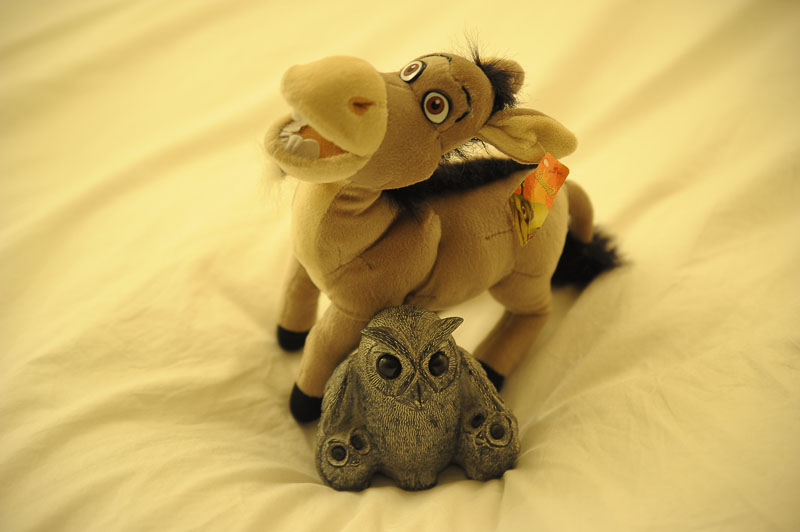
That’s the Tammy shot in basic jpeg along with the raw image. So here is the raw image processed in ACR and downsized and sharpened appropriately to render the sculpture as it looks in real life …
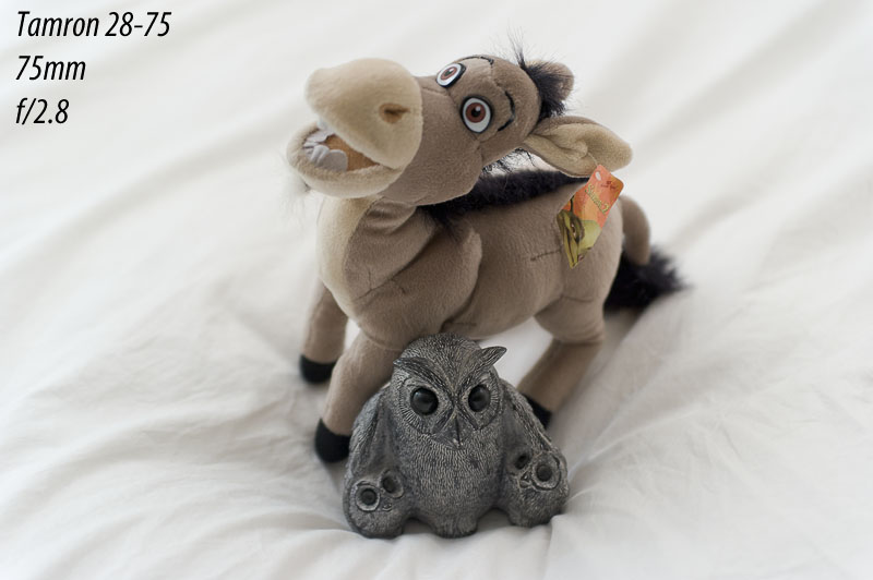
Some observations (which are a little easier to see if you click through to the larger version) … first, the Tammy id decently sharp wide open. At 2.8, shooting at 75mm, the Donkey’s tail is already blurred, so this lens creates very nice soft backgrounds. And note that the proportions here feel very natural. A pretty nice portrait lens.
But then there is the Nikon 85mm 1.8D … here it is shot wide open.
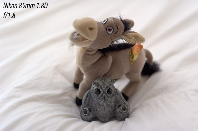
First thing to note is that the owl looks a little less sharp. (Again, click through to see what I mean.) But that’s more a question of the extremely shallow depth of field than any inherent weakness of the lens. The bottom of the owl is already blurring. Remember that this image has 1.33 stops more aperture and thus that much less depth. This is a great portrait lens.
Switching to the Nikon 70-300VR to get very different perspectives on these fellas. The first image is at 70mm, which on this lens is as sharp as any prime. This lens is liked even by professionals because it gives up no sharpness to lenses 5 times the cost … the one thing it does give up is aperture. Of course, that is no small thing which is why so many people still carry the back-breaking 70-200VRII …
Anyway … here is is in all its glory.
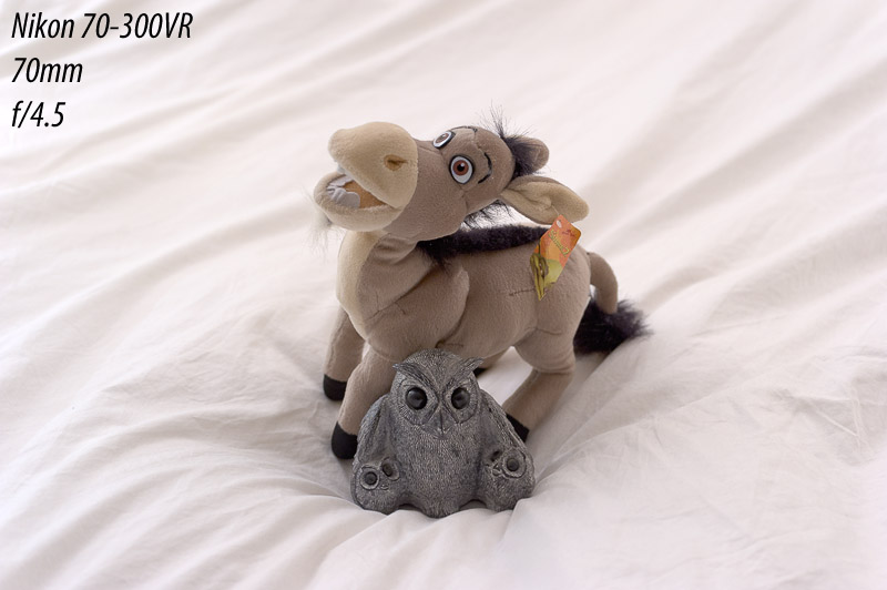
A couple of things are immediately apparent. First, the image is smaller from two causes: the lowest focal length of the bunch, and the worst closest focus distance of the bunch. So not a great close up focal length on this lens. Still, a nice image and wicked sharp. Because of the higher wide open aperture, there is more depth of field, which means everything is nicely focused, assuming that is desirable in this instance. The background is obviously also in focus, which is rarely desirable.
Obviously, the similar focal length does leave these two in pretty natural proportion to each other. But let’s shoot at 210mm now …
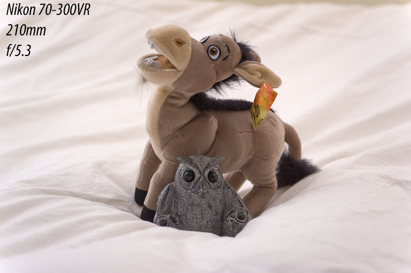
To shoot this, I had to back off, which lowers the angle of attack. The longer focal length pulls the background in and makes depth of field quite shallow. This lens remains stunningly sharp from 70 through 200 and obviously this focal length is still pretty amazing.
The proportions are changing a bit here … the whole frame is compressed from front to back, which affects the previously mentioned background, but also has an effect on the subjects themselves. They look shallower, which flattens faces etc. It’s a nice portrait length I find.
And finally … I back off even further and shoot at 300mm.
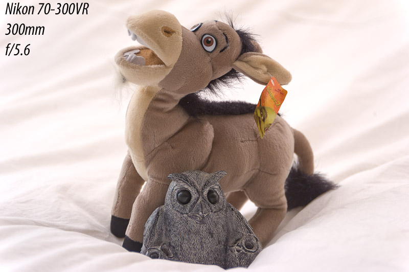
I’m really liking this image … I have always loved the look of head shots at 300mm. Flattens everything out nicely and pulls the background really close while softening it. This is how people are shot against the setting sun etc. … the longer the lens the better.
And for those who like to chant that this lens is not sharp at 300, well, that’s true for edge to edge sharpness, but for portraits it is plenty sharp as it does not have problems in the center. Quite lovely.
This lessening of the depth is very pronounced as focal length gets longer. This is why you should be shooting street candids, flower portraits, that kind of thing from a long way away at full zoom mostly. It helps to isolate the subject by narrowing the amount of background that can be seen and by pulling it inward and blurring it somewhat. Shooting at 300mm can make what would have been a mediocre image at 50mm look great …
Remember that this is not a formal test … just a bit of fun with focal lengths.
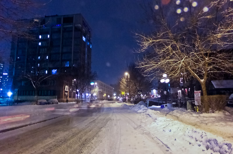
F300EXR – Fun with Pro Low Light Mode
I had the pleasure of driving the 30km in tonight’s snow storm to pick up my son and I brought the F300EXR for a bit of fun. The HS10 went back to Toronto today via FedEx so I must look elsewhere for my fun …
I knew the roads were crappy from the drive home, but was dismayed to see that the snow was still falling as I left the house a few hours later. Not a huge volume, but a constant fall.
This one was pretty blue after setting white balance on the ground near the driver’s door, so I neutralized much of the color, leaving mainly reds. I also hit it with heavy NR and managed this nice smooth, almost painterly look :-)
Pro low light definitely works well, but wonky light will still make for problems. These nasty overhead lamps give off a really warm and ugly light that the camera has real trouble dealing with.
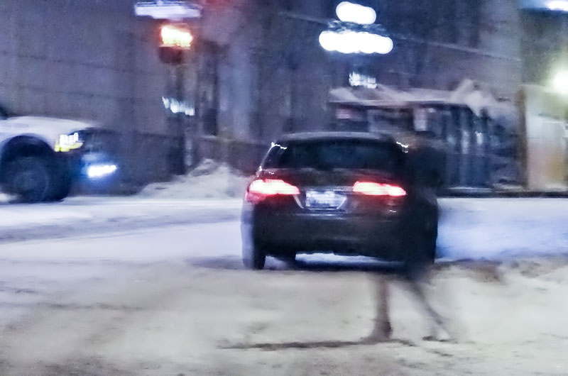
The next three images are shot while waiting for him to come downstairs and through my windshield, so don’t be too hard on them. They were shot only to see how pro low light handles moving cars and people.
First, the phantom car …
Next, the ghost troupe …
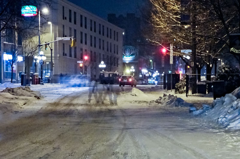
And another ghost …
Shot from tripod, you could get some really kick-ass images … I think I might try that on the canal one weekend with the skaters … I wish I’d thought of it with the HS10 last weekend.